
Project overview
Redesign Jobscan Homepage
This is a 2 days design challenge for Jobscan, an online service to help job seekers optimize resumes and LinkedIn profiles. I redesigned and created an initial design for the homepage and progress tracking page.
Go To Case Study 1: Homepage >
Go To Case Study 2: Progress Tracking Page >
case study 1
Current Design - Homepage
The platform aimed to help user optimize their resume and LinkedIn profile with their designed algorithm specifically for Application Tracking System.
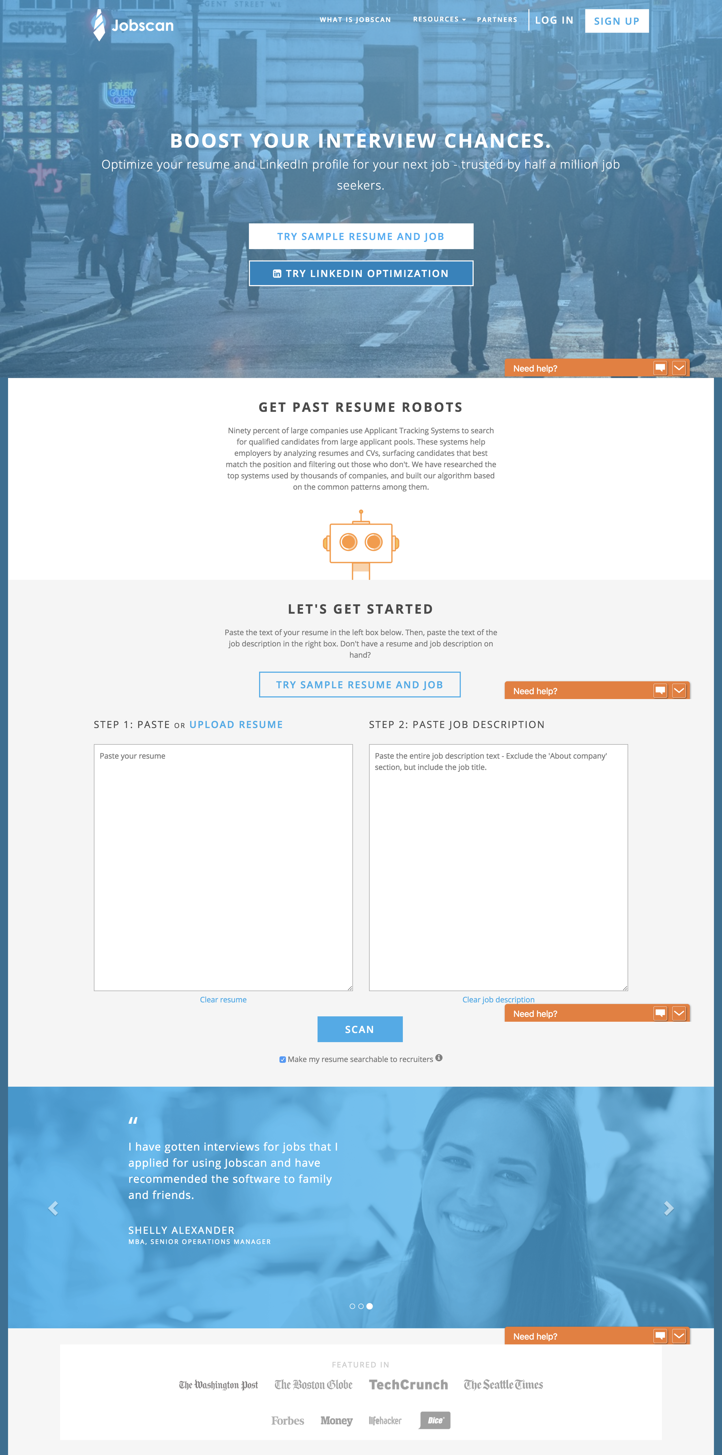
The UX problems are :
1. The call-to-action at the header is unclear. As a user, I would like to see what are the values of the product that I could benefit from it.
As a result, a clear step flow should be the first thing to begin engaging with the product.
2. Resume and LinkedIn optimization process currently are two different experiences, but both reports are the same.
As a result, it could be combined into one unified experience but allow users to select two different input formats.
Redesign homepage
Redesign : Focus On The Value
Highlighted the value that users can be benefited from the product and provide a clear call-to-action to get started.

My UX decision :
A clear call-to-action, "Try Jobscan" or "Get Your Free Scan".
A clear flow of the steps and the user can immediately engage with the product.
Show the value of the report, what the report looks like and how it will help improve your resume?
Highlight key value the user could be benefit from.
A more focused call-to-actions with different options. Users might have some concerns about plans or services and want to know more.
Encourage the user to the blog for more relevant content as a way to remain on the site.
Before

After

Case study 2
Current Design - Tracking Page
After you log in, this is the homepage. The user could get information about how many scans have created and the match rate of your resume with the job description.
redesign page
Redesign : Focus On Action
What is the first thing the user want to do when coming to the site?
They probably want to upload a new resume to match with a new job description. So "Create New Scan" should be the first thing the user see.
I also redesigned the visual hierarchy into a more clear and easy to read arrangement at the Dashboard section.


Create New Scan Action
This pops up when user clicks on the Create New Scan button. There should also be a save later button once they put in information.
Before

After
View next project - Echo Spot